I should preface this entire blog with a fact. I am not, in any way, claiming or pretending to be a sports analyst, writer or reporter. I am NOT affiliated with the Denver football Broncos at all. I am simply a lifelong fan of the team and a season ticket holder. Now, let’s grade some new uniforms! On Monday, the Denver Broncos unveiled what has been a VERY highly anticipated new uniform design. Many of us in Broncos Country have been waiting for this. Some of us had expectations while others were just ready for a change. I am somewhere in the middle of that. This article will be focused on the jerseys and helmets. They did add new pants but come on, they’re pants. There are many different color combinations as well with the pants being white, orange and blue. First, let’s check out what is new.
The New Jerseys
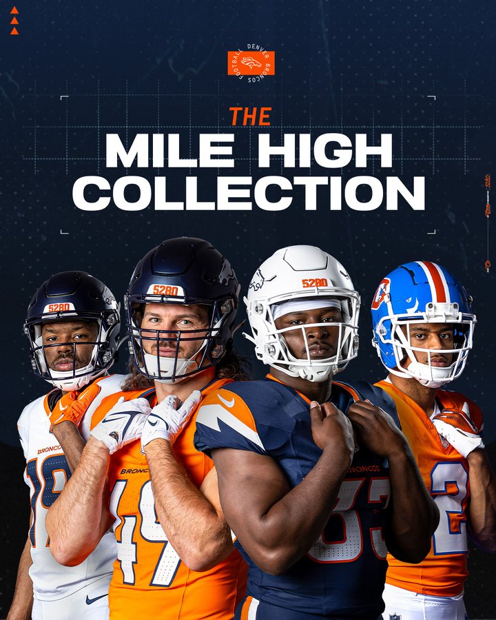
Starting with the jerseys, there are 3 in total. The “Sunset Orange” home jersey, the “Summit White” away jersey and the “Midnight Navy” alternate jersey. On each of these is a new sleeve cap that is meant to represent the mountains along with a portion of the primary Broncos logo, specifically the jawline area. The team has also added a nod to the fans on the inside of the neck on each jersey with the words Broncos Country along with a vertical 5280, representing the Mile High City. The use of triangles throughout the numbers add a nice touch and contrast as well. There is also a new triangle on the back of the neck area meant to acknowledge summit markers. I won’t even bother “grading” these individually as I love them all and would give them a solid A- as a group. Overall I think they nailed the update without getting too out of hand. Here are some individual comments:
Sunset Orange – I love the look, it looks familiar enough with some nice additions. Just the classic orange look I would expect. Probably my third favorite of the three.
Summit White – This one is my favorite, and probably my first purchase. The white looks kick ass with every pants combination and is just clean as hell! It pops, and I love it.
Midnight Navy – This is my second favorite one of the three. A lot of people in Broncos Country hate the look, but I think this one is WAY better than the previous blue jersey. This is the one where I noticed the sleeves more and I can see why some people are bent out of shape that they look like lightning bolts. Calm down, it looks fine. This with the blue pants and white helmet? SIGN ME UP!
The New Helmets
Ok, let’s move onto the helmets! I will start off by saying, I love these. I was such a fan of the white helmets the team rocked last season with the older looking D logo. I am so glad they updated them, and added a matte metallic navy blue option.
Navy Blue – A+ and honestly, something I have selfishly wanted forever here. The matte look is SO SICK on helmets and this is just a great example. Updated but not crazy. They added the 5280 on the front which I love, and kept with the triangle theme with the back. I believe this one can be worn with the Sunset Orange home jersey and the Summit White away jersey only.
White – As much as I love this helmet, I will go with an A- simply because I think they should have done something to differentiate it a little bit more. I love it, don’t get me wrong. But still. Similar to the Navy Blue option, this has the 5280 on the front and triangles up the back (these are blue versus the orange ones on the blue helmet). It just looks CLEAN and I love it. I sort of wish they had kept the other D logo, more on that later though. This helmet will be worn with the Midnight Navy alternate jerseys and to be honest, they look sick as hell together.
Combinations
I won’t dig TOO deeply on this but I wanted to add a fantastic tweet (or whatever it’s called now) from a super talented guy, Ryan Greene. I think it illustrates what I love the most with the changes and that is, versatility. Out of these combinations I have three that I absolutely freaking LOVE!
Best – Looking at the above tweet, let’s start with the top row, third over. The white helmet, blue jersey and blue pants. This gets a SOLID A+ for me overall. I just absolutely love this look and it would be so deadly if the league allowed the blue helmet as an option but since the jersey is alternate I don’t believe they do. My favorite of the bunch!
Second Best – The bottom left with the blue helmet, white jersey and blue pants. A for this combo, it is so sick looking. I hesitate to give it the full A+ treatment solely because if we are being honest here it screams Chicago Bears. But, I can get past that because I am a homer and safely say I love this look.
Third Best – Finally, my third favorite is the bottom right. The blue helmet, white jersey and orange pants is a great look! I would give it a B+, basically for the same reason as above but I do love it for what it is.
As for the rest? I would give the blue helmet/white jersey/white pants (top middle) combo a B. I don’t hate it, I just also don’t love it. Seems somewhat plain to me. I am not a fan of the blue helmet/orange jersey/orange pants (top left) combination AT ALL. I do like our orange jerseys, but not with the orange pants. It just looks weird to me. C- for that one. And finally, the white helmet/blue jersey/white pants combination (bottom middle) is just “meh” as the kids would say. It feels like a college uniform to me. I cannot pin why exactly I don’t love it but I don’t. I actually don’t like it. D+ for me on that one.
Throwback – Bonus Round!
I can only assume if you are here, you are either a fan of the Denver Broncos, you like reading an uneducated opinion about uniforms or you don’t like me and just want to leave a shitty comment. Either way, allow me to gush a little after you watch this:
Props to the Denver Broncos marketing team here. This video was so sick and the fact that it included my favorite current player and best CB in the league, Pat Surtain II just makes it better. Wait, it gets better? Of course it does. Made possible by none other than HALL OF FAMER Randy Gradishar! I love this guy, I had the pleasure of meeting him a couple years ago and got to just chat with him and he was nice enough to offer me some signed pictures. Anyhoo, we have ourselves a proper throwback uniform! I know a lot of people in Broncos Country are hitting the obvious layup of “why aren’t these are normal uniforms?”. I cannot say I disagree, but just be happy they listened and we have them in some form. I started rooting for the Broncos in 1985 when my parents moved us from Iowa to Colorado so these are what I remember most. I won’t even bother explaining, they are an out of the stadium home run A+++ and I cannot wait to get one, and watch them play in them.
I mean, LOOK AT THOSE!!! This, by a longshot, is my favorite new uniform of everything that was announced. Remember earlier when I whined about the D logo on the white helmet? Yeah, I think I’m good now. It ties in the nostalgia from before with an updated look and feel. That helmet alone just gets me all tingly. So on the eve of the 2024 NFL draft, I can safely say that I am pretty excited for the long-term future and I think that the new owners have their finger on the pulse of improving the team overall. I cannot wait to spend way too much money on new jerseys soon! Next up, following the draft, I plan on giving my thoughts on the picks the team makes.